Vans In The Circle

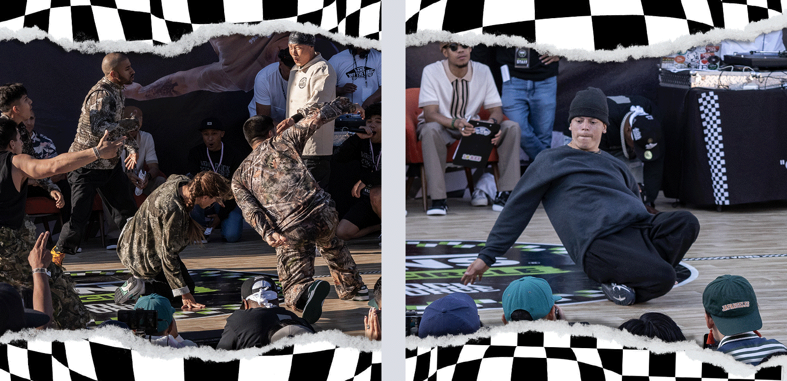
Vans In The Circle is one of the largest breakdance events in the U.S., drawing dancers from across the globe. The event gained worldwide recognition for its energy and cultural impact.
Services Provided
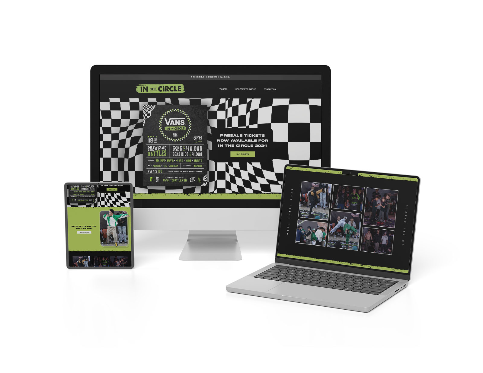
The challenge was locking down a visual identity that hit hard across the logo, flyer, and website—keeping it on-brand while channeling the raw energy and hype of the event.
By collaborating closely with the organizers to understand the brand and audience, I needed to develop a unified design system that tied every asset together, building excitement and consistency across all platforms.
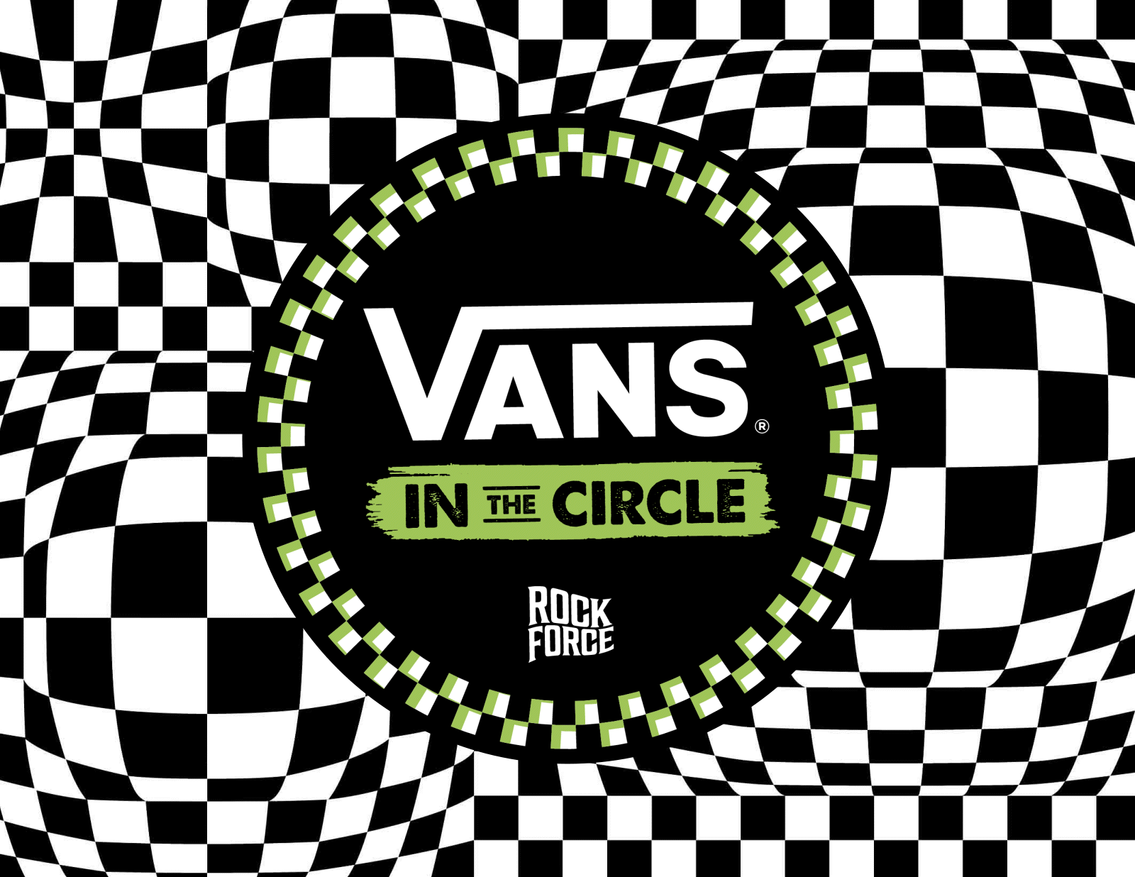
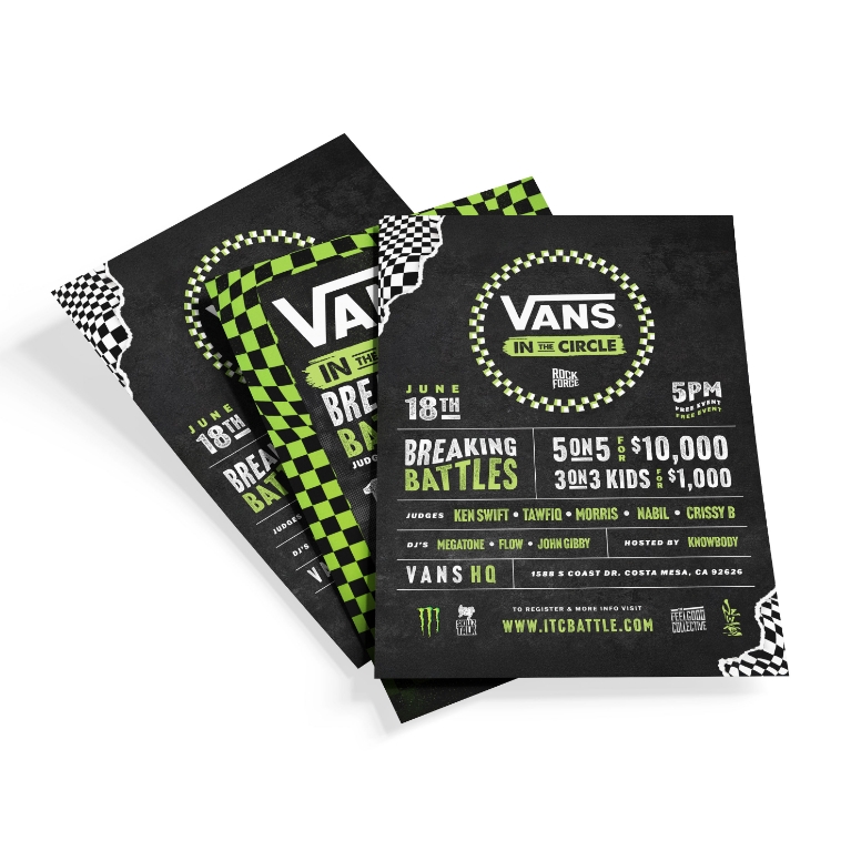

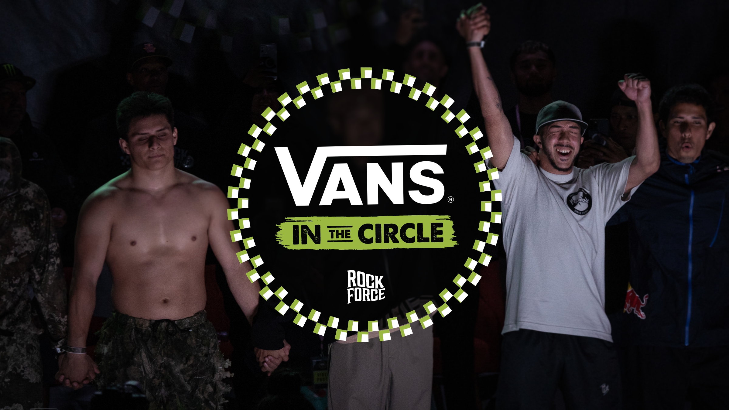
I developed a design system that set the tone with a bold logo lockup, then extended that identity seamlessly into the flyer and website.
I established a visual language built on energetic typography, a high-contrast color palette, and dynamic layouts that translated the event’s raw energy into a cohesive look and feel. Each asset was designed to work independently while reinforcing the larger identity, ensuring consistency from print to digital.